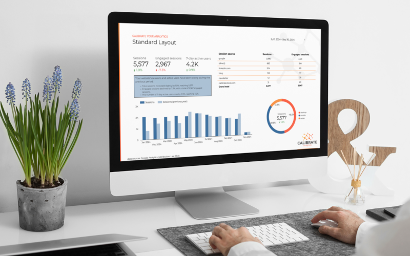
Creating a polished and cohesive report in Looker Studio can impress your stakeholders and convey your data insights effectively. Here's a step-by-step guide to help you achieve just that.
Gather Information
Before diving into your dashboard design, collaborate with stakeholders to gather essential information. Define the following:
Main Objectives and Primary Metrics
Determine the overall layout of your report by identifying the key metrics important to your stakeholders. Ask them about the metrics that matter most. These objectives will shape the length and complexity of your report.
Needs of End-Users
Consider who will be using your report and their purpose. Think about the user experience (UX) design elements that will benefit them, such as date pickers and other dynamic features.
Brand-Specific Elements
Align your dashboard with your brand by defining a color palette with good contrast and easy readability. Use accent colors to highlight specific data points. A balanced look can be achieved with a set of 3-5 core colors, including primary, secondary, and accent colors.
Here are a few sample color palettes curated by the Calibrate team. Consider these for your next dashboard design!
Modern
|
Vibrant
|
|
|
Casual 
|
Dark 
|
Select fonts that are readable and consistent with your brand. Limit font styles to two: one for headers and another for body text. Adjust font sizes and weights to create a clear design hierarchy.
Establish Your Layout
With all the necessary information in hand, you can now establish your layout. Use primary metrics to guide your design and create a visual hierarchy that prioritizes critical information and directs the viewer's attention. This hierarchy can be achieved through:
- Placement: Position crucial metrics at the top or center, where viewers typically look first.
- Size and Weight: Highlight key data points with larger or bolder elements.
- Grouping and Spacing: Organize related information in clusters with clear separations to create intuitive groupings.
- Multi-page Navigation: Add navigation links on all pages for easy access to relevant sections.
This hierarchy is especially vital for multi-page reports. Start with an executive overview on the first page, and drill down into specific metrics on subsequent pages.
Add Interest
Iconography
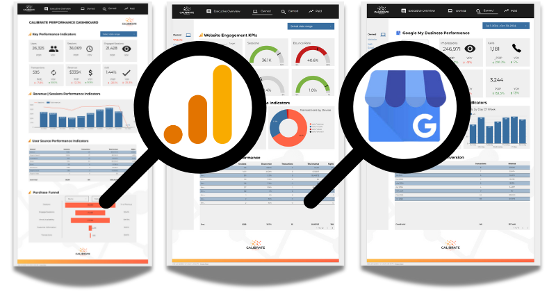
Icons can enhance brand recognition and aid quick comprehension. For instance, placing the Google Analytics icon next to a graph immediately indicates the data source. Ensure icons have a consistent look and are vector-based for scalability across different screen sizes.

Design Elements
Borders, background shapes, and visual dividers can help organize information and add branding touches. Keep these elements subtle to avoid clutter that detracts from the data.
Gather Feedback
Once your initial report is ready, share a prototype with key stakeholders for feedback. This step helps identify any UX issues, misalignments with brand guidelines, or opportunities for improving layout and readability.
By following these steps, you can create a Looker Studio dashboard that aligns with your brand, engages users, and provides a seamless, professional experience. If you need assistance with creating a Looker Studio report for your business, the Calibrate team is here to help.


