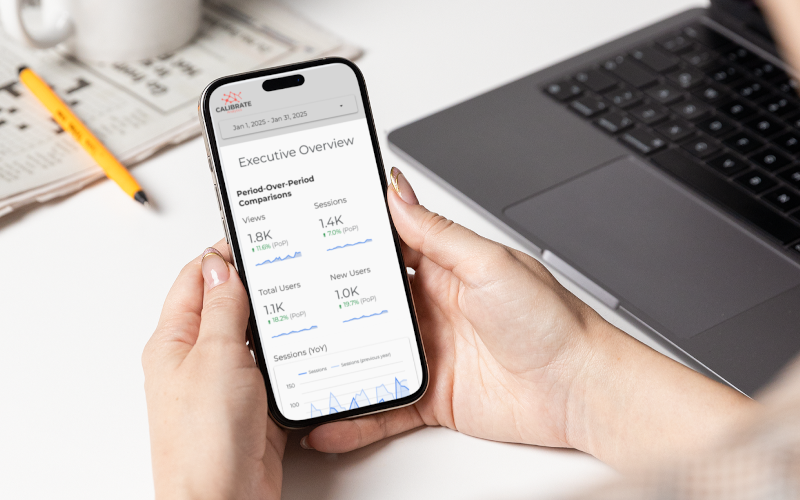
Google Looker Studio recently added a long-requested feature: responsive dashboards. This update makes it easy to create mobile-friendly reports for KPI checks in real time
The responsive dashboard layout is powered by grids and smart spacing rules, so your layout stays simple and polished, without needing to code or layer elements. This format works well for quick KPI overviews and mobile-friendly status checks.
What Is a Responsive Layout in Looker Studio?
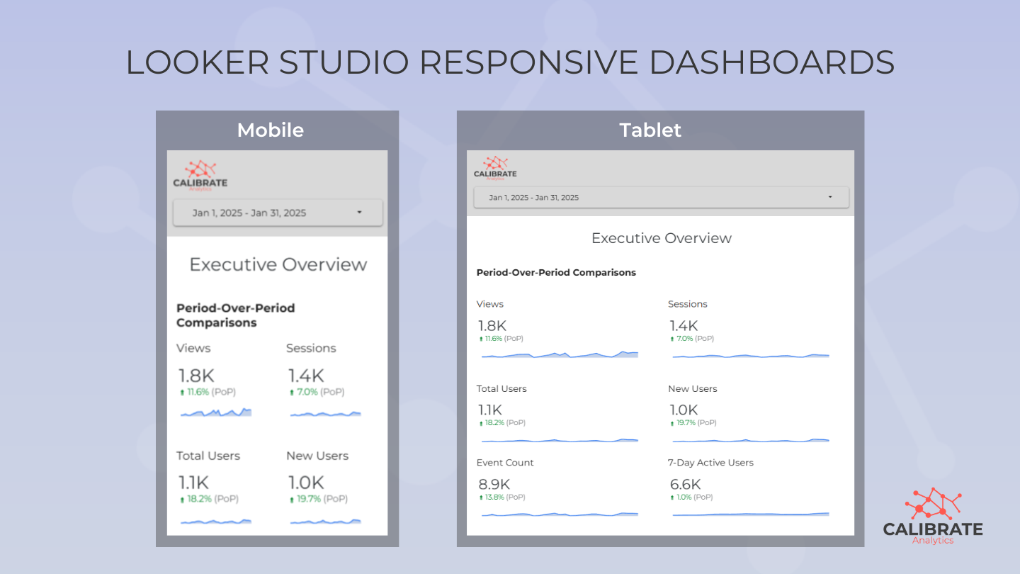
Responsive reports automatically adjust layout and components to fit your device screen size. The new layout is based on a 12-column grid that scales charts and components to fit smaller screens while keeping the layout clean and organized.
Responsive vs. Freeform Dashboards: You Still Need Both
Looker Studio freeform dashboards are robust with features that allow you to overlap and layer elements. However, if you've opened one on your phone, you know how frustrating it can be to view it on a small screen. Responsive dashboards let you visualize the same data in a way that makes it easier to view on smaller screens.
Marketing Analytics teams will need to maintain two separate dashboards. Responsive dashboards are created from scratch, and you can't convert an existing freeform report into a responsive format.
While at first it might seem inefficient to recreate existing reports, the time you invest upfront will pay off with a smoother mobile experience. Since responsive dashboards are designed for mobile, they may look awkward on desktop. We recommend bookmarking both versions of the report for easy access.
Why Responsive Reports Are Useful
Responsive layouts improve how reports are viewed across mobile and tablet devices, letting you view clear KPIs when time and context matter most. Responsive reports offer:
- Seamless viewing across phones and tablets.
- Clean layouts without extra formatting or coding.
- Less time spent redesigning reports for different use cases.
- Quicker insights for decision makers who are on the move.
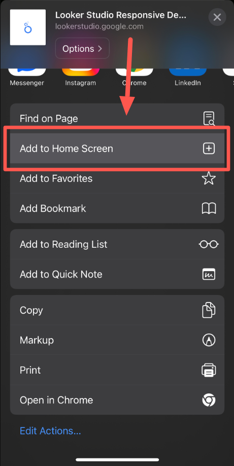
Save time by adding the report as a shortcut icon on your phone's home screen, eliminating the need to search for a link every time.
Five Responsive Report Tips from Calibrate Analytics Experts
As you start exploring responsive reports, keep these tips in mind:
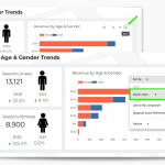
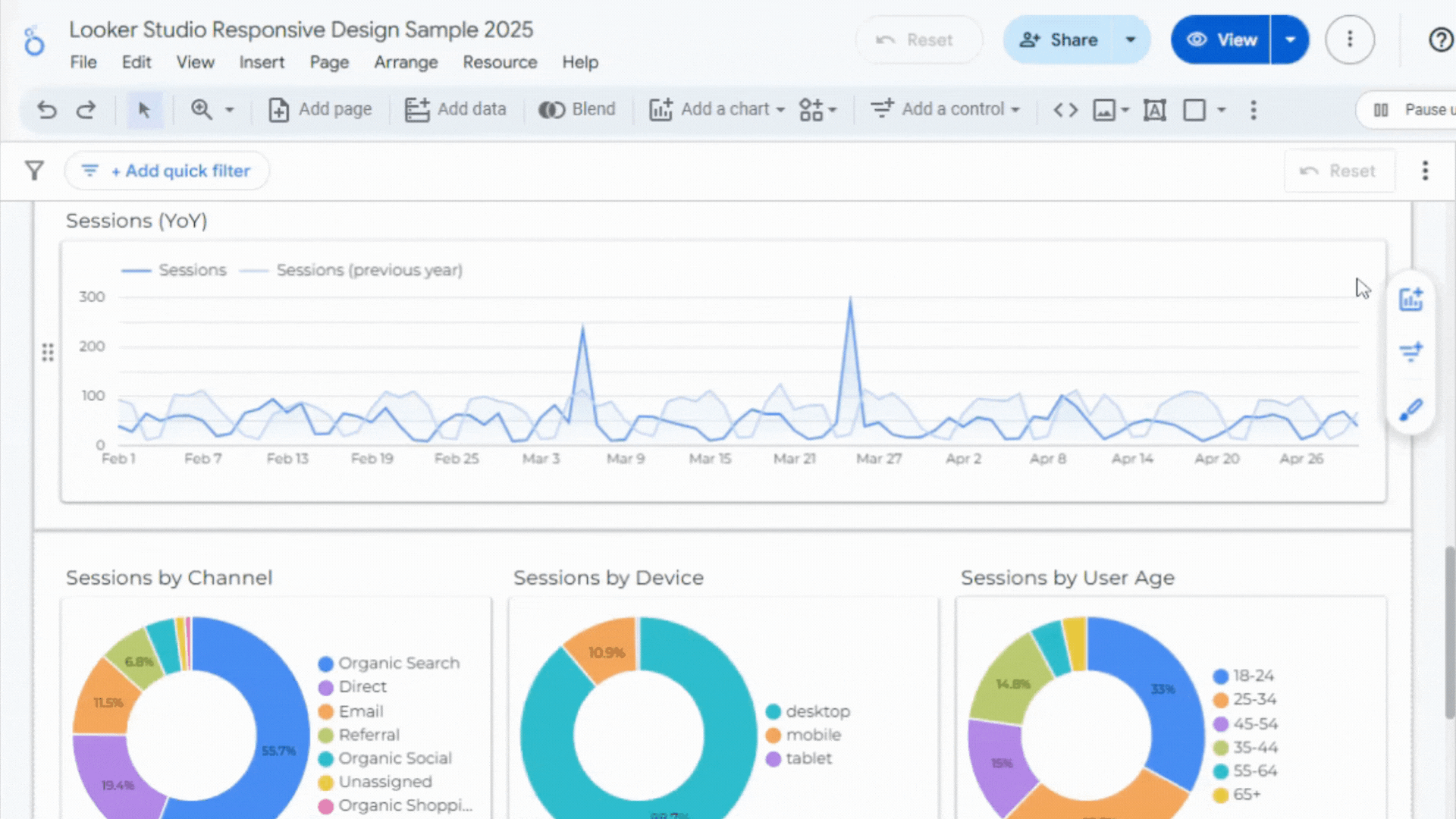
- Focus on scorecards, simple line graphs, pie charts. Avoid text and column-heavy tables.
- Utilize sections and blocks to ensure elements align and scale properly.
- Keep your design clean and minimal, only isolating top KPIs.
- Pay attention to font sizes being too small on mobile and update the details within chart styles accordingly.
- Test your layout across multiple devices before sharing.
How to Build a Responsive Report in Looker Studio
Looker Studio's responsive layout is a module-based design that spans 12 columns, and can still incorporate your most important charts and metrics. Getting started is easy, just follow these steps:
- Create a new report and add your data source.
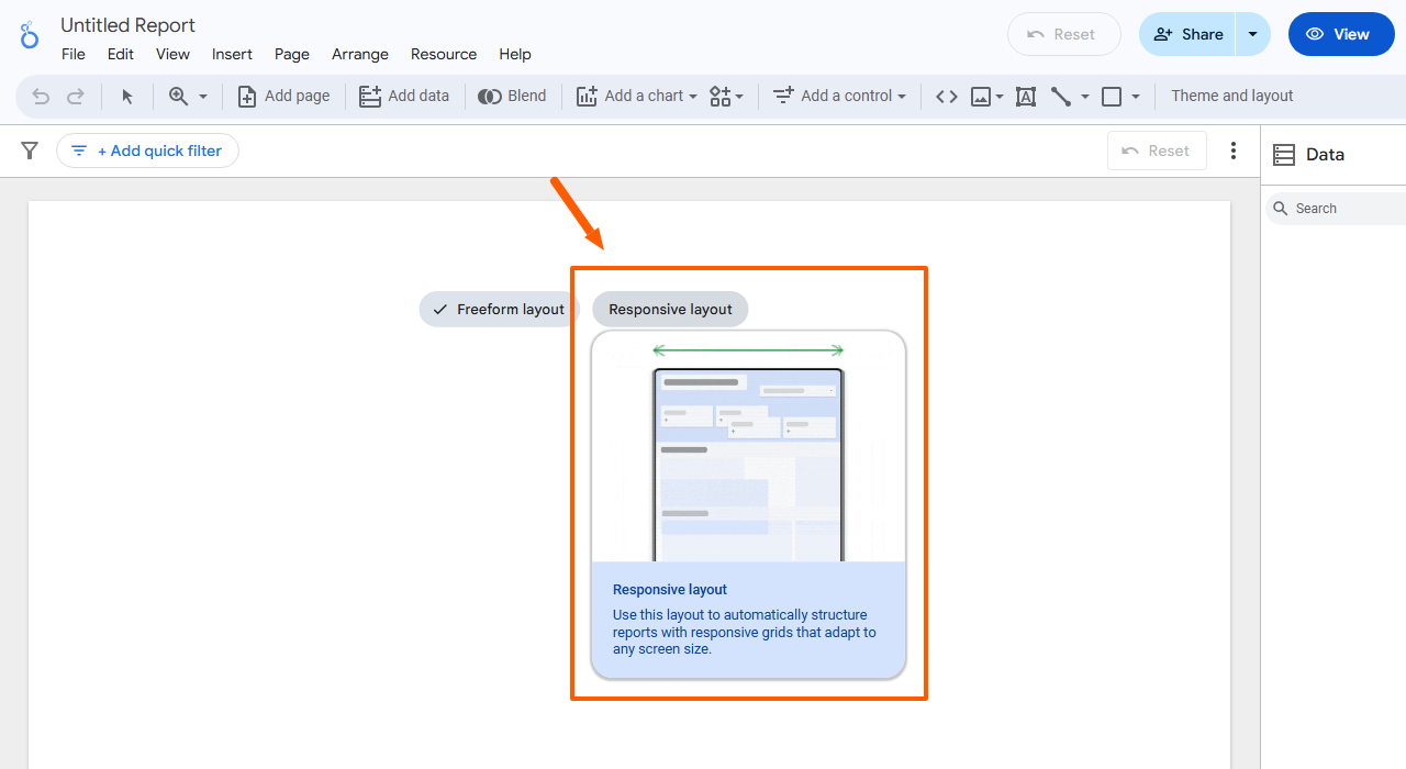
- Select the "Responsive Layout" option in the report settings.
- Build and stack your charts into sections and blocks, focusing more scorecards and impactful visuals.
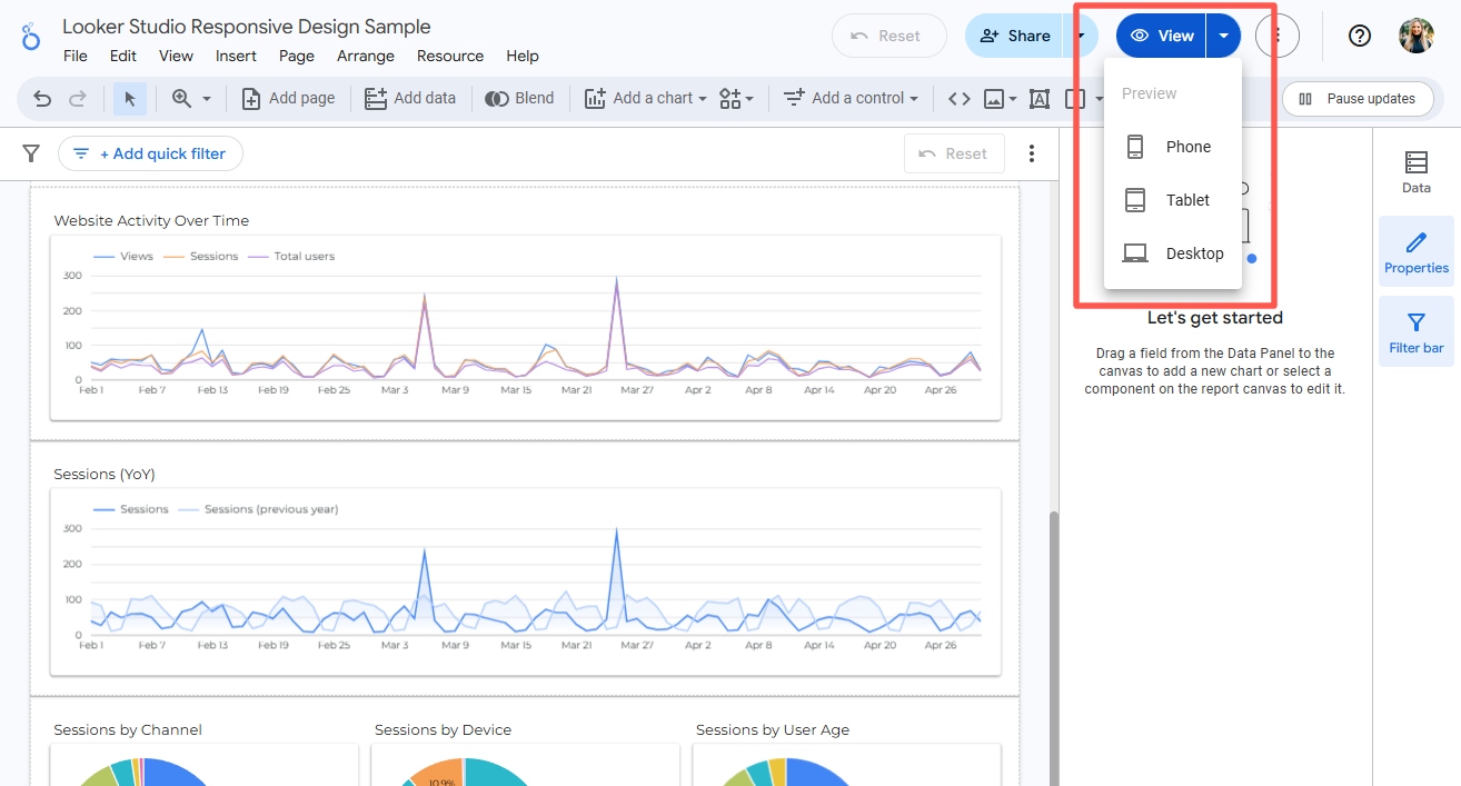
- Preview on multiple screens before sharing with stakeholders by clicking “View” then navigating to your desired device.
Need to See More Than Just GA4 Data?
Responsive Looker Studio reports clearly display GA4 data across mobile and tablet devices, which is especially helpful when stakeholders want quick access to metrics without digging through detailed dashboards.
Are you looking to incorporate data from sources like Facebook, Google Ads, CRM, or other APIs? Calibrate Analytics can help you connect additional sources into Looker Studio.