Google's latest Data Studio updates give report creators more control over dashboard design and usability. The recent release includes six additions: component rotation, fullscreen charts, centered labels on stacked bar charts, copying charts as PNG images, settings search, and bubble chart border controls.
Our favorite? Rotation! It's a small change that opens up more possibilities for report design, especially when a standard layout needs a little more customization.
Here's what's new and how the updates can improve your reporting workflow.
- Rotate text boxes, images, and shapes
- View individual charts in fullscreen
- Center labels on stacked bar charts
- Copy charts as PNG images
- Search for settings
- Customize bubble chart borders
For the full details, see Google's Data Studio release notes.
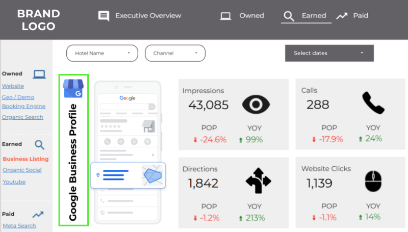
Rotate Text Boxes, Images, and Shapes
The feature we're most excited about is the ability to rotate text boxes, images, and shapes. You can adjust the angle of individual components and reset them to 0° when you want to straighten things out.
Why does it matter? Sometimes a reporting layout needs something more than just another pie chart.
Angled section headers, rotated images, and decorative shapes offer more options for organizing a report or drawing attention to a particular insight. Even a slight rotation can add visual interest or help an element fit a custom layout.
You always want rotation to serve a purpose. A dashboard full of tilted headings probably won't help anyone find their KPIs faster. But for report creators who want more design flexibility, this is a welcome addition.
View Individual Charts in Fullscreen
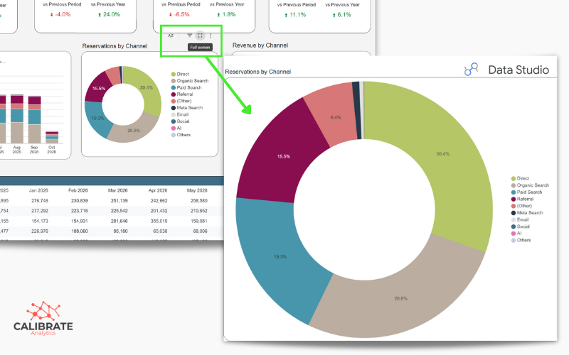
When a detailed chart is competing for space with several other visualizations, it helps to give it the spotlight.
The fullscreen button in a chart's header expands the visualization without requiring changes to the report layout or a separate page. It's particularly useful for charts with multiple data series, long dimension names, or detailed labels.
During client presentations and reporting reviews, this makes it easier to focus on a specific visualization while keeping the larger dashboard intact.
Just note that fullscreen mode isn't available for scorecards or gauge charts. For supported charts, though, it's a simple way to give the details more room.
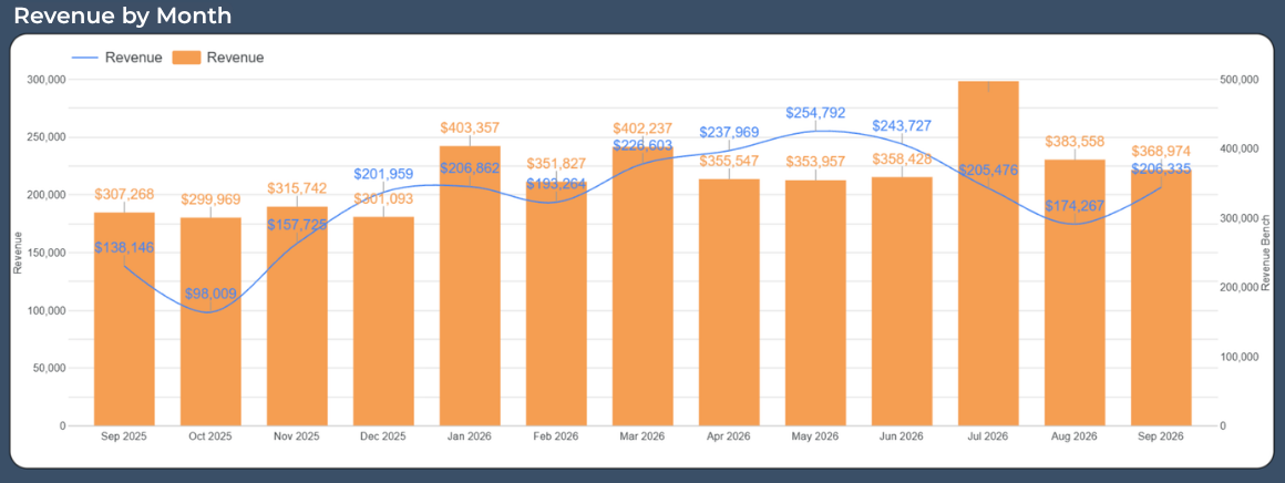
Center Labels on Stacked Bar Charts
Stacked bar charts are useful for comparing how different categories contribute to a total, but labels can get messy when several segments compete for space.
The new "center label" position places values in the middle of their bars, and if a segment is too small to accommodate the label, it's automatically moved outside the bar. This makes it easier to understand values, especially when a chart contains several categories.
As always, consider the chart's readability before choosing a label position. Centered labels work well when segments have enough room, while smaller segments may be easier to interpret with labels placed outside the bars.
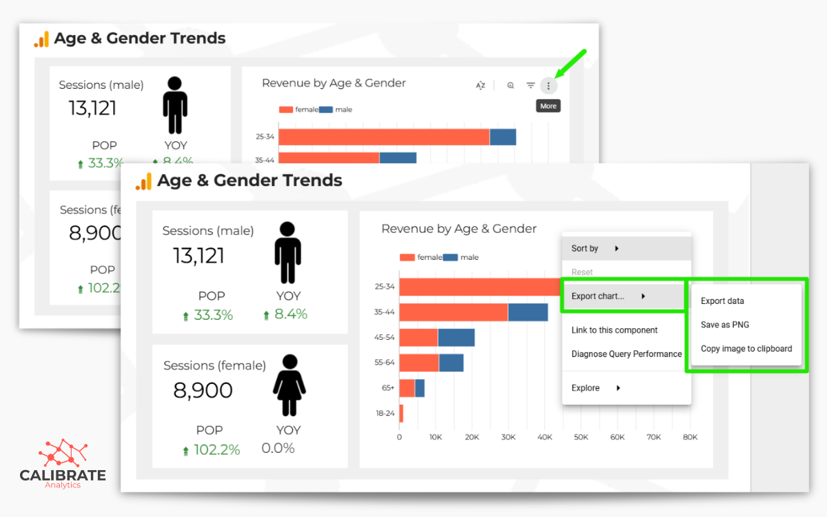
Copy a Chart as a PNG Image
Data Studio now lets you copy an individual chart as a PNG image directly to your clipboard, ready to paste into a presentation, document, or email.
You don't need to export the entire report or take a custom screenshot just to share one visualization. This is a useful shortcut for anyone who regularly pulls reporting highlights for clients or colleagues.
Just remember that a chart separated from its report may lose important context, including date ranges, filters, and comparison periods. Include those details when they're necessary to interpret the numbers.
Related article: Say Goodbye to Screenshots: New Image Export Options in Looker Studio
What These Updates Mean for Your Dashboards
Rotation, fullscreen viewing, label positioning, and PNG copying focus on the reporting experience. The other additions, settings search and bubble chart border controls, offer more convenience and customization within the editor.
None of these changes alters how your data is collected or calculated. Their value comes from giving you more options for presenting and working with that data.
The usual dashboard principles still apply: prioritize the metrics people need, maintain an accessible layout, and choose charts that make the information easy to interpret. Extra design flexibility is useful, but the goal is still to make the numbers easier to understand.
If you're looking for inspiration, Google's guide to types of charts in Data Studio is a useful reference when deciding how to present different kinds of data.
Putting the New Data Studio Features to Work
If you maintain client dashboards or recurring reports, these updates are worth testing on a few existing pages. Try rotating components where a different arrangement would help, use fullscreen mode for detailed charts, and experiment with centered labels on stacked bars.
A few small adjustments may be all it takes to make a familiar report easier to navigate, present, or share.
If your dashboards need more than a cosmetic refresh, Calibrate Analytics can help you review your reporting setup, chart choices, and overall structure. Get in touch if you'd like to talk through ways to make your reports more useful.