Preparing data to share with others can be time consuming as it's often done manually in Powerpoint. A while back we started to style our dashboards to look like the slides we needed to present. The result was always having an updated presentation that could be quickly sent or shared on request.
Using Data Studio as a replacement for traditional slides has served us so well we've decided to share an example so others can benefit and hopefully get some time back. Here's an example of a Google Data Studio dashboard styled to look like some of our slides.
https://datastudio.google.com/s/rwIUV8hknms
High Impact image with a metric overlay

Google Data studio template styled to look like a Powerpoint slide
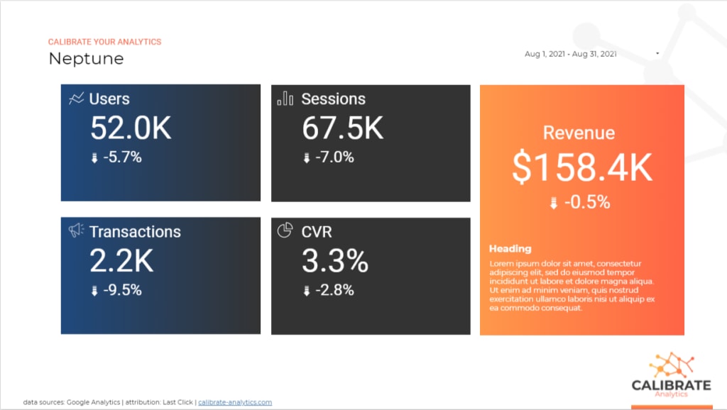
Google Data Studio dashboard presented as a monthly report slide