When we think about reporting, we focus on the visuals: dashboards, KPI scorecards, and executive summaries. These are the most visible parts of reporting and the ones most often used for day-to-day decisions.
But effective reporting doesn't start with visualization. It starts with the quality of the analytics stack behind it.
Picture an ice cream cone. The scoops are the dashboard, analysis, and visual layer everyone sees first. The cone provides the support: data accuracy, storage, and transformation. Without a strong foundation, your top layers won't be as meaningful as you think.
The Layers Everyone Notices
These are the reporting aspects that receive the most focus due to their ease of understanding. They're the elements stakeholders engage with directly, frequently shared in screenshots and presentations, and often influence initial perceptions of reporting quality.
Analysis
Analysis is where data becomes actionable. It's the top scoop, the point where insights take shape and decisions are made.
This layer is about:
- Summarizing performance
- Identifying trends and anomalies
- Comparing time periods
- Highlighting key takeaways
- Recommending next actions
It answers key questions:
- What changed?
- Why did it happen?
- What should we do next?
Keep in mind these questions can only be answered effectively if the report you're analyzing is accurate.
Visualization
Visualization is the scoop before analysis. Good visualization makes complex information easier to understand, especially for teams that need to scan performance at a glance.
This includes:
- Dashboards
- Charts and graphs
- Executive scorecards
- Presentation-ready reports
Because visualization shapes perception, it gets prioritized. It's the part people see first in meetings and reports, which is why it tends to carry the most weight.
The challenge is that reporting efforts often stop here, focusing on the output without validating whether the underlying data is correct, scalable, or properly structured.
The Layers That Create Trust
This is where trustworthy reporting is built. While these layers are less visible, they determine whether the numbers behind the dashboard are accurate, consistent, and scalable over time.
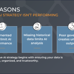
Data Accuracy
Before data is stored, transformed, or visualized, it has to be collected properly.
This includes validating:
- Tag management
- JavaScript event tracking
- Cookie and consent logic
- Campaign codes and UTM governance
- Conversion event validation
When the tracking setup is flawed, every chart and insight built on top of it becomes unreliable.
For example, a missing tag can undercount conversions, a duplicated event can inflate revenue, and inconsistent campaign naming can make channel reporting a headache.
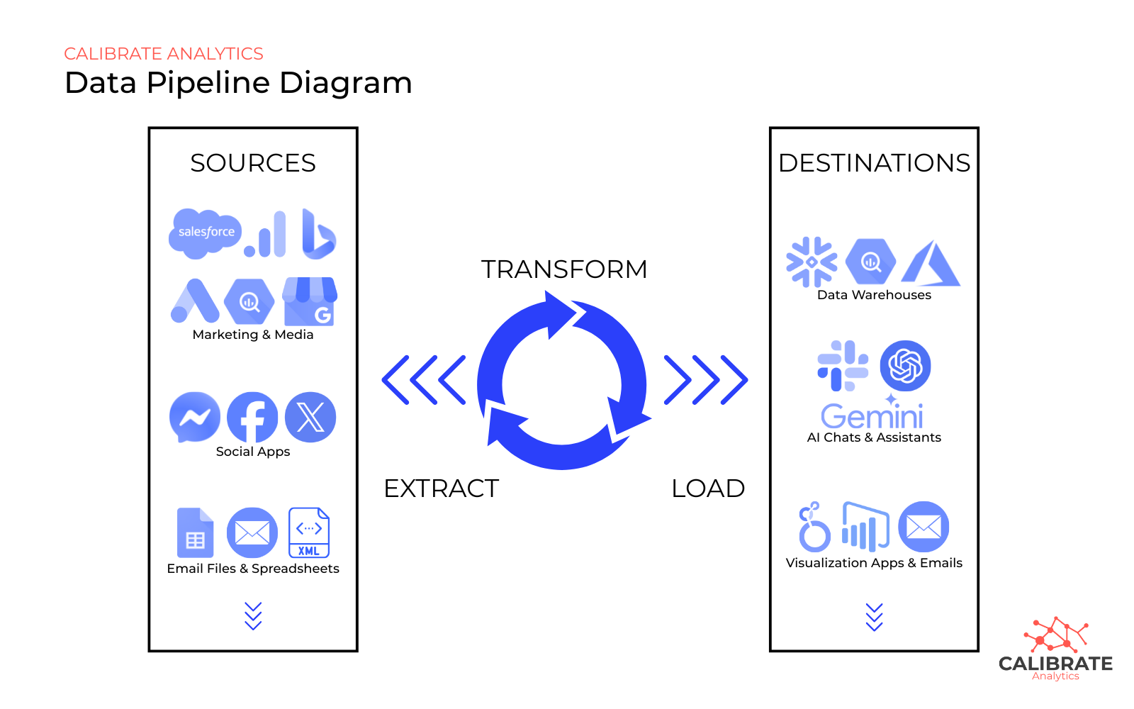
Storage
Once data is collected, it needs a reliable place to live, typically a cloud database or warehouse environment that can scale with the business.
This supports:
- Centralized reporting data
- Secure access controls
- Scalable historical storage
- Fast query performance
- Cross-team accessibility
Spreadsheets and platform exports will work early on, but as data volume grows across analytics platforms, ad channels, CRM systems, and ecommerce sources, they become difficult to maintain.
Related Article: Data Pipelines: A Guide to Data Management, Real-Time Analytics, and Leveraging the Right Kind of AI
Transformation
Raw data is rarely ready for analysis on its own. The transformation process involves applying business logic to the data so that the final tables reflect a consistent record of metrics and performance.
For example, one platform may use a YYYY-MM-DD date format, while another uses MM-DD-YYYY, or you need the dataset formatted a certain way. If you rely solely on APIs, none of it is customizable.
Transformation includes:
- ETL and ELT workflows
- Data cleaning
- Joining multiple data sources
- Metric standardization
- Calculated KPI logic
- Predictive and modeled fields
This is also where teams can introduce advanced use cases like forecasting, anomaly detection, and machine learning-based performance models.
Why the Foundation Matters More Than the Dashboard
When the numbers look off, the performance often gets blamed first, but the issue could be behind the scenes.
Common causes include:
- Missing tracking
- Inconsistent campaign taxonomy
- Poor storage structure
- Incomplete joins between systems
- Unstandardized transformation logic
A Better Way to Build Modern Reporting
Improving reporting quality starts beneath the dashboard.
A strong framework looks like this (and the order matters):
- Validate tracking and data accuracy
- Centralize data storage
- Standardize transformations
- Build analysis workflows
- Design visualization layers
When the base is solid, reporting becomes faster, more trustworthy, and much easier to scale.
This reduces time spent troubleshooting discrepancies and makes it easier to act on insights quickly.
Final Thought
The most effective dashboards are not defined by how polished they look, but by how much confidence they create.
Analysis and visualization are what people see. Data accuracy, storage, and transformation are what make those insights dependable.
At Calibrate, we help strengthen that foundation, from tracking integrity and pipelines to scalable storage and reporting-ready transformations, so dashboards support faster, more confident decisions.